Visualizing network traffic
A short guide to turning raw measurement data into useful visualizations.
Tools to consider
- Python — Pandas for data cleaning and Matplotlib/Seaborn/Altair for plots.
- D3.js for interactive bespoke web visuals and animations.
- Kepler.gl or deck.gl when you need to map flows and geolocation traces.
Workflow
- Clean and normalise timestamps and IP addresses. Convert timezones to UTC, parse and validate fields, and canonicalise hostnames/IPs.
- Aggregate at a meaningful timescale. For latency, think about per-minute or per-hour aggregates; for availability, event counters over a day may be better.
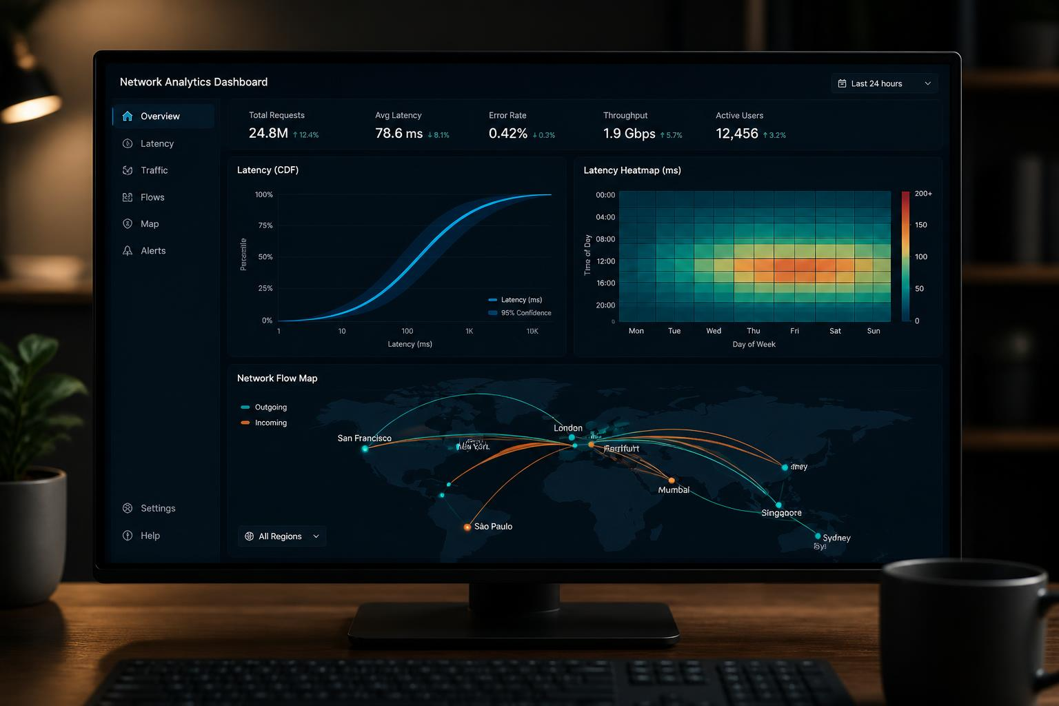
- Choose visual encodings carefully: use CDFs or violin plots for latency distributions, heatmaps for diurnal patterns, and flow maps for geographic movement.
- Consider interactivity: allow filtering by region, time window, or probe group so readers can explore hypotheses.
- Annotate uncertainty: show sample sizes, confidence intervals, or shaded regions to indicate variability rather than relying on single lines.
Quick example (Python/Matplotlib)
# assume df has columns: timestamp, rtt_ms
df['timestamp'] = pandas.to_datetime(df['timestamp'], utc=True)
df.set_index('timestamp', inplace=True)
series = df['rtt_ms'].resample('1Min').median()
series.plot(kind='line')